Great design, when it comes to a user’s experience (UX), can help your digital or physical product enrich lives. However, if it makes the user’s experience difficult, bad things can happen.
If you’re lucky
The bad thing might only be a loss of revenue as customers get fed up and abandon carts during the sales process. According to this Reimagining Commerce report, consumers don’t purchase online because they either couldn’t find what they were looking for (54%) or because they didn’t see enough information about the product (37%). Either could be UX fails.
Or, tragically, people might actually get injured—as we’ll see in the next section.
But unless they are the worst James Bond villain ever, both outcomes are the opposite of those desired by UX teams.
Don’t be a James Bond villain.
Deadly UX disasters
Challenged by too much data
One of the most told stories of bad UX leading to disasters is the Space Shuttle Challenger explosion. On a January morning in 1986, after just over a minute after launch, an O-ring seal on the Space Shuttle Challenger failed due to the cold temperatures. All seven crew members lost their lives and the Shuttle program was grounded for three years while the world’s experts struggled to discern what happened and how they could safely return to flight.

The thing is, the rocket engineers had already tried to sound the alarm about the potential O-ring failure. They included the data in a pre-flight risk presentation. The issue, according to Yale statistician and information visualization professor Edward Tufte (who also attributed the 2003 Columbia disaster to Microsoft PowerPoint) was the user experience of the delivery medium.
As Tufte points out, among other things:
The presentation of information did not consider the UX of the data, nor make the key conclusions clear for the decision makers.
In-flight UX confusion
Another example is the 1992 crash of Air Inter Flight 148. As Martin Doms points out in his article, a mode error on a display led to the crash. One section of the plane’s display had two modes for descent: Flight Path Angle and Vertical Speed. Both displayed a two-digit number, but one had the numbers separated by a decimal point. If the user (pilot) wasn’t clear which mode was being displayed, they might think the display was showing a gentle descent angle when it was really showing a too-fast descent speed. This mode error in unclear UX caused the flight to crash, killing 87 of the 96 crew and passengers.

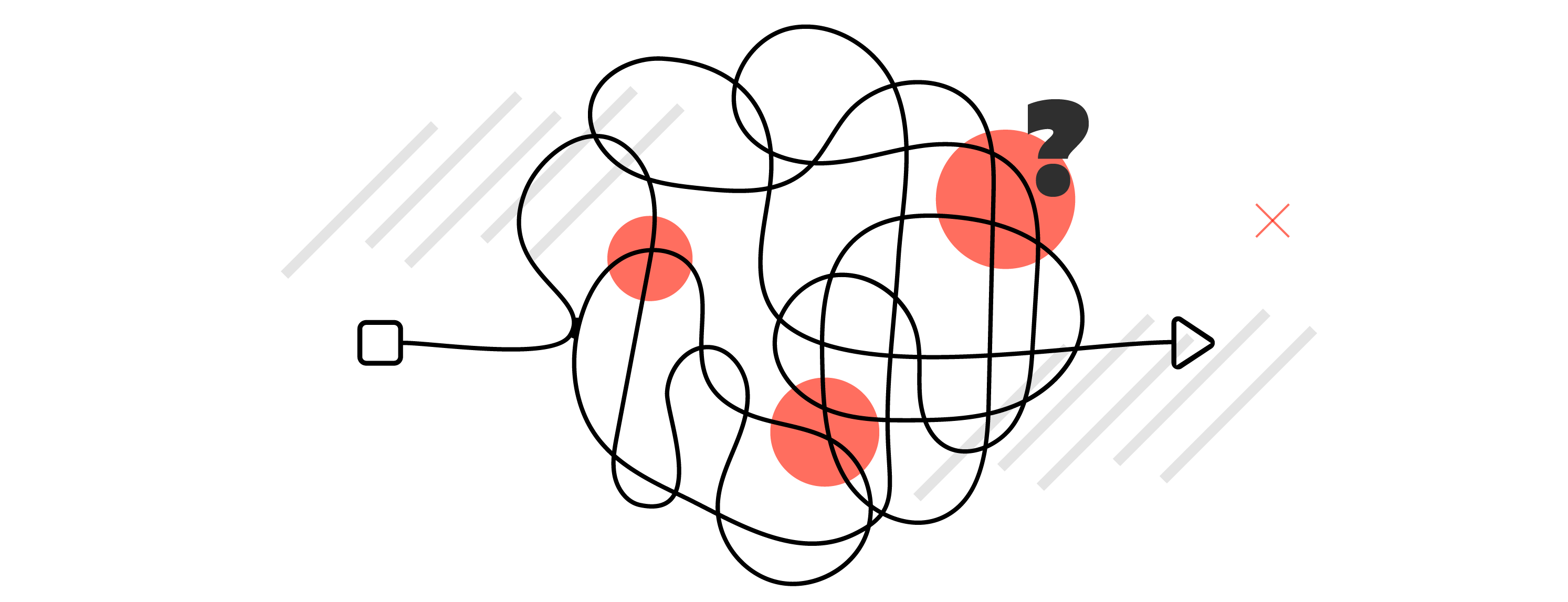
UX isn’t simply how someone uses a single button or list, it’s their entire journey through the interface from beginning to end. It considers the people using the interface (engineers, perhaps) and how outside forces might be affecting them (for example, a pilot landing a plane through thick clouds). It anticipates obstacles and presents clarity to mitigate the effects of those obstacles.

Good UX can save lives
It can help find lost people
When applied correctly, the scientific art of UX design can save lives. One example of good UX is the Department of Homeland Security Science and Technology Directorate’s First Responders Group’s Lost Person Behavior app. What makes the UX of this app so robust is the design team started with data—data from over 150,000 missing person cases. The app developers combined this data with firsthand experiences provided by Search and Rescue (SAR) teams all over the country.

The result? An app that provides SAR teams “guidance, tactical briefings, investigative questions, and statistics for over 40 different scenarios… [including] lost hikers, hunters, children, missing vehicles, despondent individuals, dementia patients, and climbers. It also provides guidance for snow and water incidents.”
Lost Person Behavior anticipates questions and scenarios with data and experience to help guide rescuers to those who are lost. It provides a great user experience to help save lives.
It can prevent deaths
Forbes highlights poison control websites used by Colorado, Nevada, Wyoming, Montana, and Hawaii. Just like the SAR app, the company creating these websites also began by analyzing data. The UX created “processes over 50,000 emergencies every year and contributed to an estimated $27 million savings in health care costs.” Plus, you know, saving lives.

According to the CDC, one poison exposure is reported to poison control centers every 14.9 seconds. Three-hundred children are treated in an ER and two die from poisoning per day. If optimized UX on a poison control website helps prevent any of those exposures or deaths, then mission accomplished.
What makes good UX?
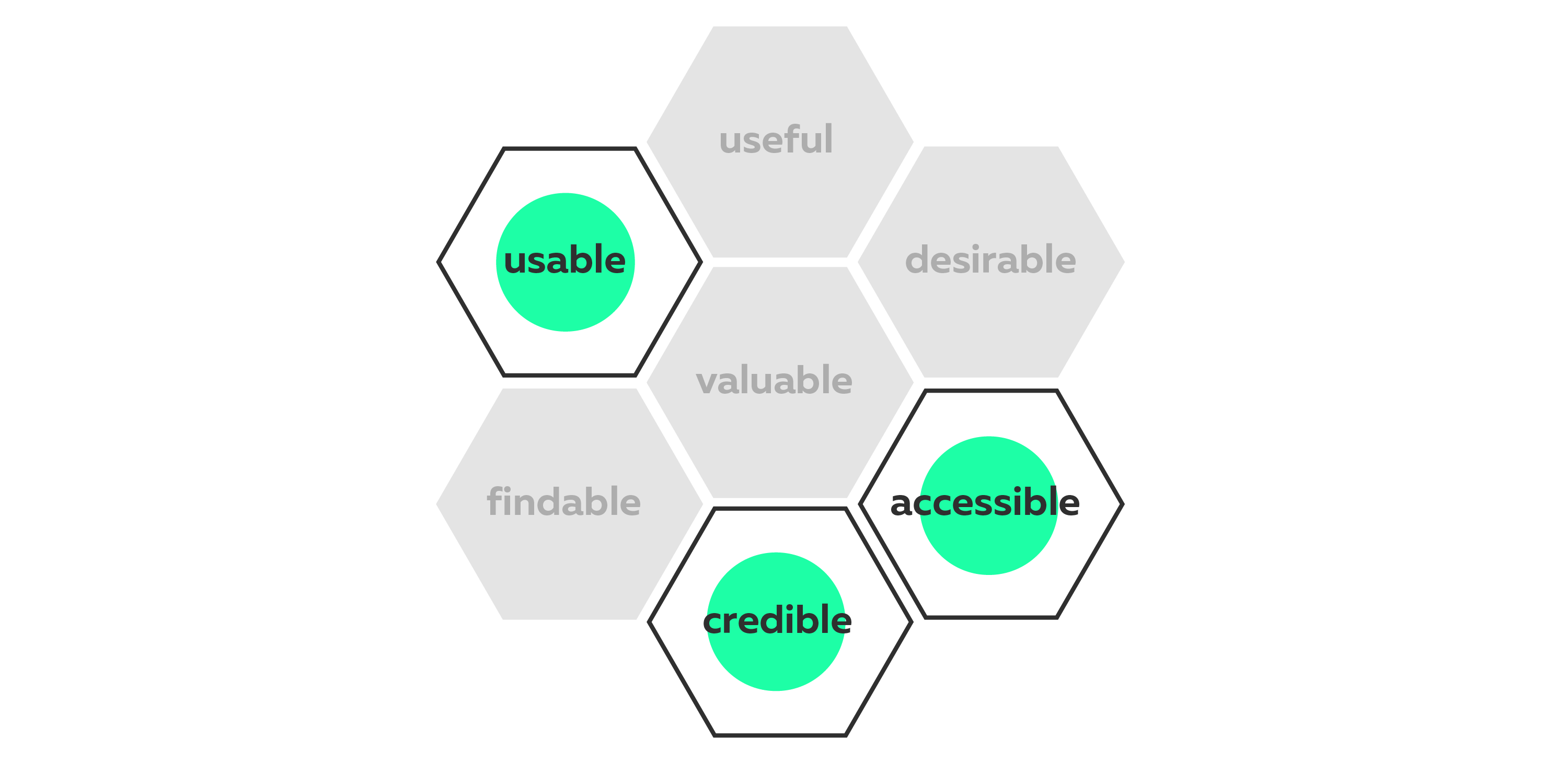
But what exactly makes a good user experience? How can your UX save lives instead of taking them? Information architect and UX genius Peter Morville developed what he calls the “user experience honeycomb.” While we won’t go through the whole thing here (you can, and should, read it yourself), we’re going to highlight three of the honeycomb’s cells.
Even if life and safety don’t hinge on your interface, take the time to ensure your UX is providing your users with the best user experience possible. Because if you don’t, someone else will and your users will become your ex-users.
Need to rethink your UX/UI? Let us know.