Here’s how it works:
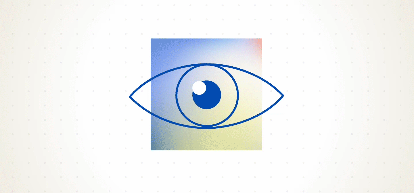
The Squint Test helps you instantly see whether a page’s visual hierarchy is doing its job: guiding users to the most important content without friction and following a clear, purposeful path through the page. If the first thing your squinty eyes notice is a flashy promo banner or an off-topic button, then the design is failing to support the user’s main goal.
Take a restaurant website, for example. If the first thing that grabs your attention is a callout for their sister restaurant, while the menu, hours, or location are hard to find, that’s a UX issue. The design is getting in the way of what the user came to do.
During our Lunch and Learn, the ADG team got hands-on with the Squint Test. We participated in a blind test using blurred screenshots and evaluated a mix of sites—some from well-known brands, some from our own archive. It was amazing how much we could assess without reading a single word. We asked:
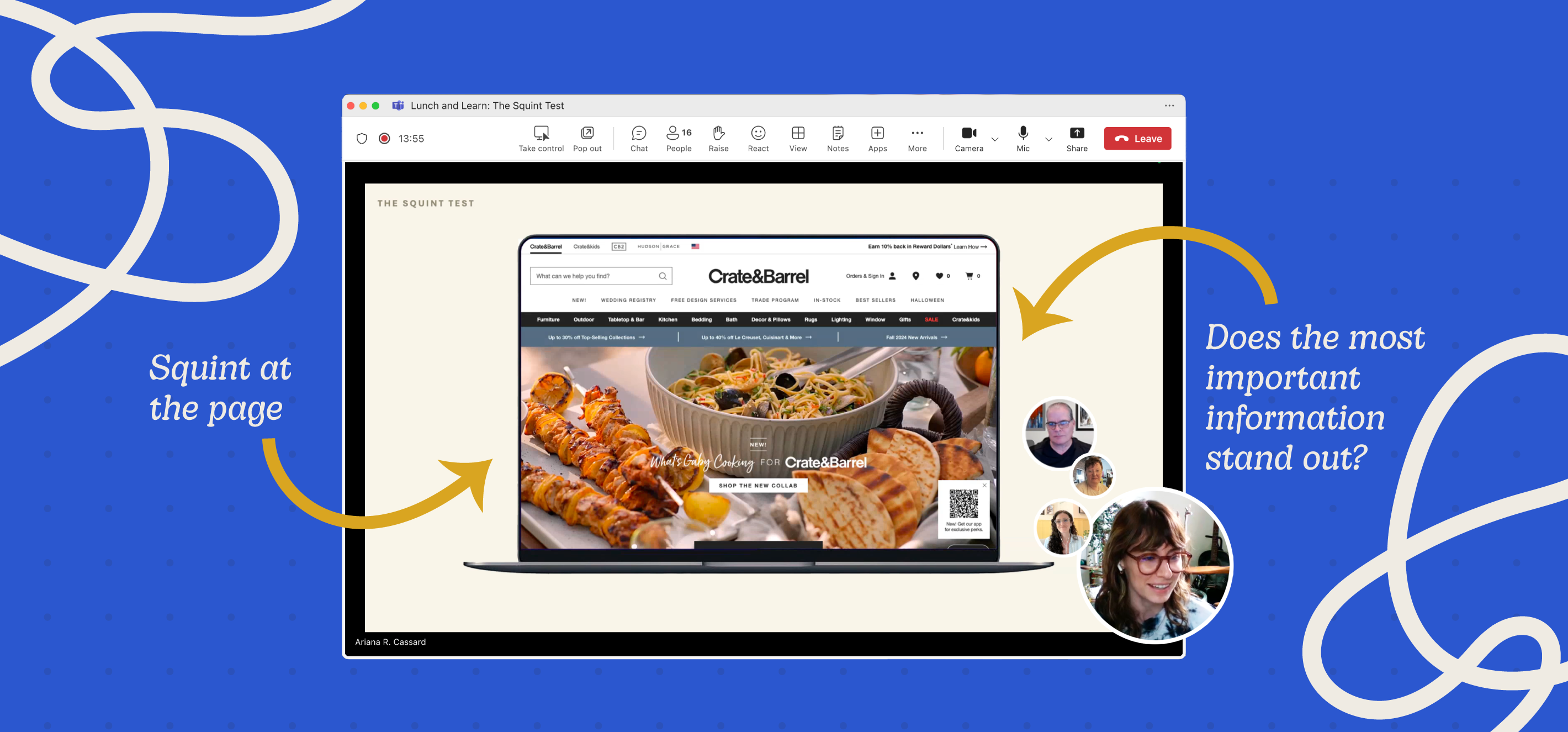
The conversation that followed was both validating and eye-opening. Designers, strategists, and writers were able to spot disconnects we might not have noticed otherwise. We saw common missteps like visual clutter, competing calls to action, and poor contrast in key areas. Most importantly, we discussed how to fix them: by adjusting layout, color, scale, or simply reducing noise.
So next time you’re reviewing a web page or interface design, try stepping back (literally or figuratively) and squinting. If your eyes are drawn to what matters most, you’re on the right track. If not, you’ve just uncovered a quick opportunity to improve the user experience.
The takeaway? Simple techniques can lead to powerful UX insights. As part of our ongoing commitment to design excellence, we’ll keep sharing what we learn so we can continue delivering our best for clients.
Stay tuned for more highlights from ADG’s Lunch and Learn series. And for deeper UX insights, check out training from Nielsen Norman Group.
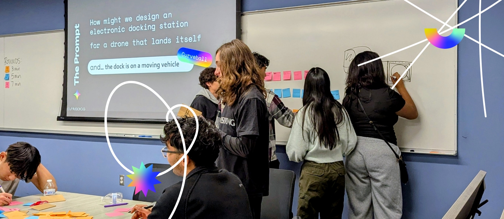
At ADG Creative, we believe that good ideas are meant to be shared. That’s why we host monthly virtual Lunch and Learn sessions. These casual, collaborative events give team members a chance to present something meaningful they’ve learned to spark conversation and continuous learning across disciplines.