But these symbols didn’t just represent concepts. They began to represent individuals and an individual’s reputation. A potter would add his special mark to the bottom of the pot so others would know it was made with his skill (and so he could charge more for it).
Some personal symbols became even more complex and developed into what we now call heraldry. Family crests. Regal symbols. Royal seals. Anyone seeing one on the outside of a document would know it was indeed sent by the queen, for example.
And then the industrial revolution produced the age of corporations. Whole businesses wanted that same recognition of the old school nobility and artisans. They wanted to put a little seed into the minds of consumers to easily identify their products and trust their reputation.
And thus, the logo (as we know it) was born.
The importance of logos
One reason symbols continue to be important is the speed of comprehension. A red circle with a diagonal line instantly tells someone that whatever is under the line is forbidden. No parking. No smoking. No ghosts.
If a woman sporting a costume with a red “S” on a yellow background appears, you instantly know Supergirl is here to protect you and you are safe from the evil power of Lava Girl. All the words of warning or exaltation don’t need to be spelled out to comprehend the meaning of the symbol.
So, a logo helps your customers identify your company in an instant. No (or very little) reading; no questions. They see your swoosh or your partially eaten apple and they instantly apply your reputation to the product. And not only your reputation but the perceived value of your product and the service and status your product will bring to their lives.
Your logo also indicates the causes and politics important to your company, and the buildings and events your company sponsors. It is your company’s seal of approval.
In short, your logo takes everything a customer knows about your company and distills it into one symbol. That symbol embeds itself into your customers’ minds where, like a seed, it eventually sprouts and spreads roots.
Relating to what Paul Rand says in the above quote, your logo’s design is the “ambassador of your brand.” But what makes it good? That’s for the next section.
Some logos are memorable, but good logos are iconic. Why? Because good logos tell a story. But not just any story. A good logo tells your brand story.
To be a good logo, it must be one with your company. That is, if your business is about protecting the oceans, a logo that looks like an oil refinery might not be the best choice. Or, if your business is very serious in nature, you might not want a cartoon chicken to be the main feature of your logo. It needs to fit and support your brand.
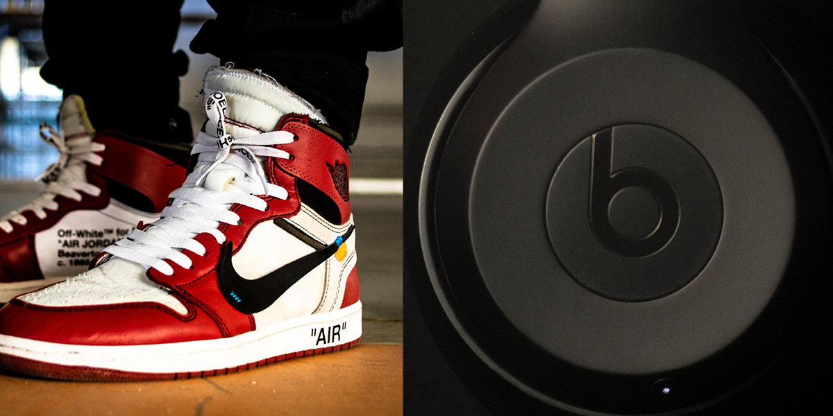
Think of some of the most famous logos you can. The previously mentioned Nike swoosh. It suggests motion, action, sport—everything an athletic company would want. The Beats logo, as another example, looks like a head wearing headphones—letting you know right away what their company is all about.
In order to be quickly recognizable, a logo must be simple and clear. It must make the most use of lines and color without overloading a customer’s eyeballs.
A good design belies the complexity required to create it. It turns all the hours of hard work into something basic, complete, and humble. As Antoine de Saint-Exupéry said, the design is perfect when “there is nothing left to take away.”
It also needs to be clear what the logo is or represents. You don’t want people to think your logo is a pile of spaghetti when it’s supposed to be a suspension bridge. You also want to make sure your logo can’t be misconstrued for anything crude, rude, or nude.
One of the final hallmarks of a good logo is its flexibility. A logo must be flexible enough to scale for different sizes and adapt to different contexts. It has to be recognized wherever it is used.
Whether your logo appears on a 48-foot billboard or a 3.5-inch business card, it needs to look and feel exactly the same. It can’t have details that are only visible at a giant size—that will break the cohesiveness of the logo design as it relates to your overall brand strategy.
Also, unlike companies in the Mad Men-era, you have to take into account different screen sizes, brightness and color settings, and resolutions. A unique shade of blue on one device might look like a weird shade of green on another. Do you need to consider using a more standardized color palette?
Your logo is a distillation of your brand in visual form. It’s the first look, the first taste, a customer takes. It must relate to your company story, mission, and aesthetics. And, it must be memorable.
When its time for your logo to be revamped, revised, or redone, give us a buzz. When you need to know how to better leverage your logo as part of your brand strategy, write to us. And if you’ve never had a logo but want one really badly, let us know.